The website of TrendsUp Media, a content localization and audio production studio: a homepage and a page system built around 35+ languages and one point of contact.
TrendsUp Media is a content localization and audio production studio. In its own words it translates, dubs, mixes, subtitles and quality-checks video and audio content in 35+ languages.
This case study covers the UI and UX of its website: the homepage in detail, and the page system behind it, designed in Figma.
A localization studio does many things in many languages: translation, casting, recording, mixing, subtitling and quality control, for microdramas, films, creators, audio shows, brands and e-learning.
The site's own message is that most localization breaks in the handoffs, and that TrendsUp built the studio the other way round, with every stage inside one workflow and one point of contact. The design had to make that feel true from the first screen: show the breadth without overwhelming anyone, and keep one clear next step, Start a project, always in reach.
The Figma file holds the main pages plus 16 service pages, 3 insights, 7 industries, 7 works, 4 studio pages, 5 legal pages and 4 team pages. The live site goes further still, with dedicated pages for the languages.
They share one frame: the same floating header, the same FAQ block and the same closing call to action, so a visitor who lands on any page already knows how the site works.
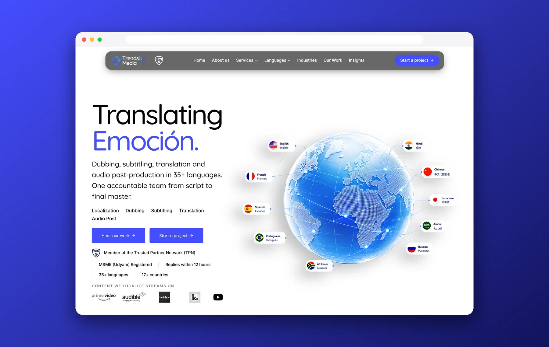
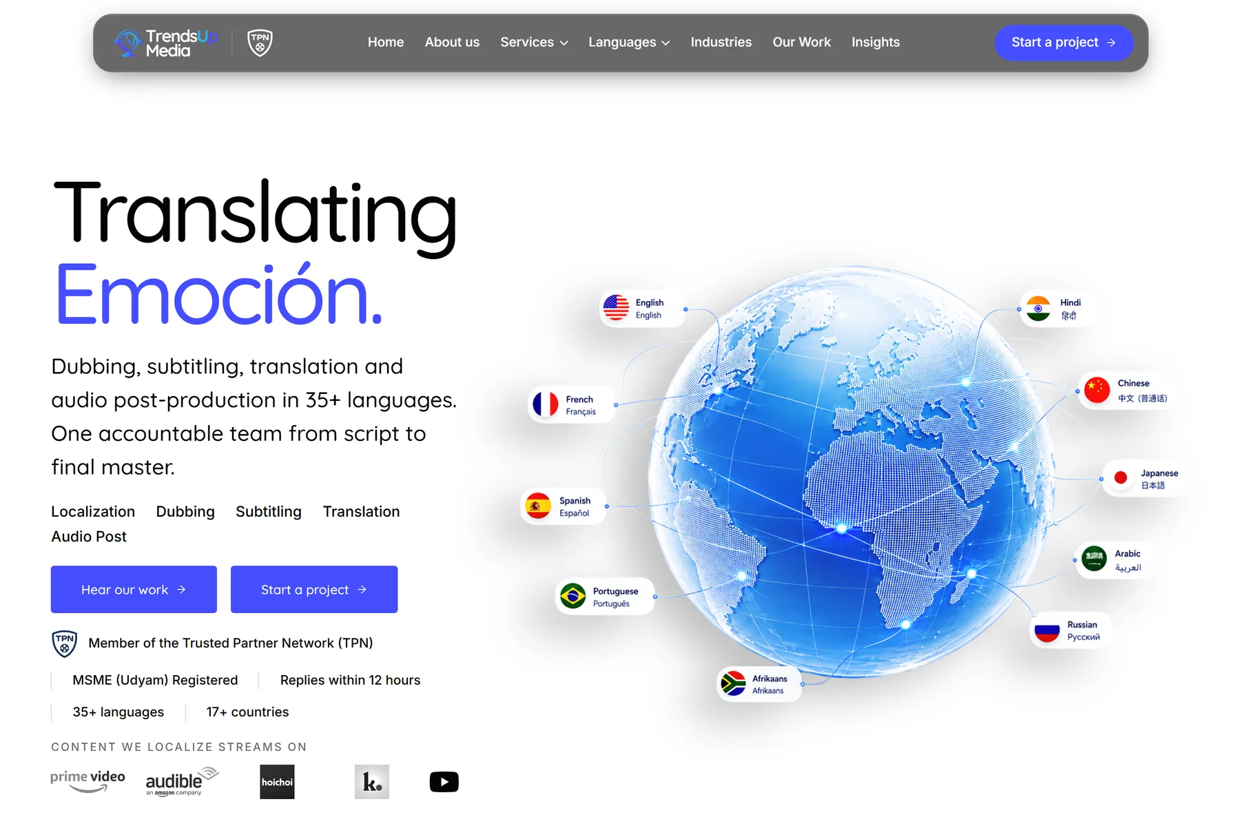
In Figma the site opens with a blue loading screen, the logo and the line Voicing worlds, and then the first screen is a poster: oversized type wraps around a globe, with the key numbers, the services and a Start a Project button placed around it like labels on a map.
On the live page the same idea is calmer and faster to read. The headline's second word switches language, from Emotion to 情感, Emoción, Émotion and 感情. Flag-labelled chips sit around the globe for English, Hindi, French, Chinese, Spanish, Japanese, Portuguese, Arabic, Russian and Afrikaans. A proof strip answers the usual doubts before anyone scrolls: member of the Trusted Partner Network, MSME (Udyam) registered, replies within 12 hours, 35+ languages and 17+ countries.
Right under the first screen come the client logos and a one-minute film, See how we work in about a minute. The About and Why us blocks then make the argument in plain sentences: translation, casting, recording, dialogue editing, mixing, subtitling and quality control inside one workflow, with one point of contact. A row of YouTube creator channels with their subscriber counts follows as social proof.
Four cards cover the studio's range at a glance, each with a one-line promise and an Explore link into its own page. A button below leads to the full list of services.
Trust is the product, so the page gives it room: a dark full-width section, one big promise and a five-step timeline that reads left to right in the order work moves through the studio.
Two sections handle the question every visitor arrives with: can you do my language, and my kind of content? The language section lists the languages ordered most often, then the rarer ones few studios take on. The industries section turns the content formats into a bento grid of black tiles, because a 90-second vertical drama, a 40-minute OTT episode and a corporate training module break in different places.
The Figma version is a free-form bento of seven tiles; the live page keeps the same idea as a tidy grid, with an Explore link on every tile.
A short dark section explains how the studio works at scale and how bulk work is priced, with a clear route to How Pricing Works. A carousel then shows a sample of delivered projects, and a four-column block says what working with the studio is actually like: one point of contact, native performers with human direction, replies within 12 hours, and confidentiality as standard.
Testimonials from clients and collaborators sit on a dark gradient, followed by a rotating globe of client logos under the line A few names. A lot of stories. The page then closes the doubts with an FAQ accordion that answers the practical questions: what TrendsUp does, how many languages, how long a project takes, whole process or parts of it, and where it is based.
Every page ends the same way: a full-width globe in clouds, the line Make your story travel, the key numbers again and one Start a Project button, above a compact footer. It is the same call to action as the header, so there is always one obvious next step.
Sections alternate between white and near-black, so the page has a clear rhythm as it scrolls. One indigo is reserved for actions: pill buttons and links. Headlines use Inter and body copy uses Quicksand, whose rounded forms keep a technical subject friendly.
The site is about voices and screens, so it moves. The hero headline changes language, and a wall of clips from films, series and anime assembles behind Every voice has a journey as you scroll. Long paragraphs reveal line by line, and the header floats as a pill. The recording shows the live homepage from top to bottom.
The design is live as the studio's website. It presents the studio's own figures: 35+ languages, 17+ countries and 350+ projects completed.
Trishir, Creative Designer, India. Portfolio website: Trish Designs (trishdesigns.xyz). Email: trishir821@gmail.com