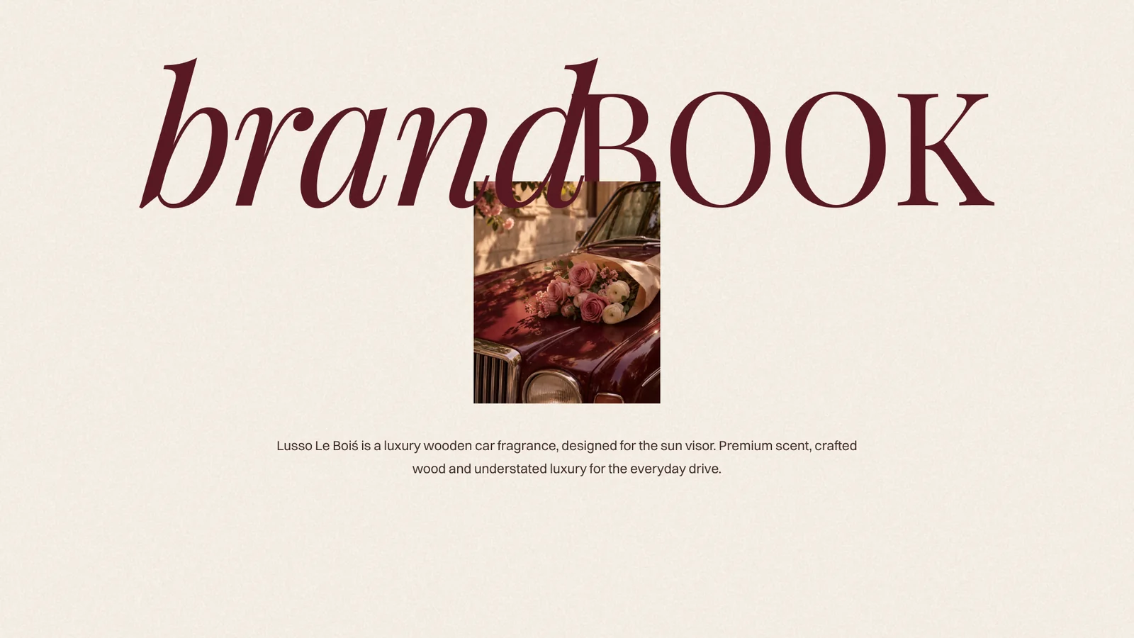
A 49-page brand book for Lusso Le Boiś, a luxury wooden car fragrance made for the sun visor. A warm burgundy, walnut and creme palette, three typefaces with clear jobs, and one quiet motif, the grain line inside the O, carried from the product to a burgundy flap box, stationery, tags and signage.
Lusso is Italian for luxury; le bois is French for wood. Lusso Le Boiś is a Mumbai-born lifestyle brand making a hand-finished wooden diffuser that clips to the sun visor and fills the cabin with a carefully curated scent.
The grain line inside the O is the signature: the ring of a tree, the curve of an open road. The book sets out how that idea looks, sounds and behaves everywhere the brand appears.
The mission is to elevate the everyday drive with premium fragrance and crafted wooden design. The vision is to be India’s most loved luxury car fragrance. Five values keep both honest.
A solid wooden diffuser on a slim metal clip, finished by hand so no two grains are the same. Each scent owns one colour from the palette, used on its box, scent card, product page and social posts.
Natural wood, a considered scent and minimal design. The moodboard sets the temperature: golden hour, soft leather, roses, warm interiors and the diffuser catching the light.
Short sentences, sensory words like wood, warmth and light, sentence case, and no hype, stacked emojis or exclamation marks. The brand is never loud, salesy, cheap, cluttered or over-technical.
For design-led drivers of premium cars across India, Lusso Le Boiś is the luxury wooden car fragrance that turns the sun visor into a statement. Not a typical car air freshener, but a luxury lifestyle object.
The guidelines cover the full lockup, the O on its own as an icon for the product and social avatars, and the Lusso wordmark for wide, short spaces. Colourways, finishes from wood grain to gold foil and blind deboss, placement on photography and the laser-engraving spec for the product are all set out, along with what never to do.
Creme carries every layout. Burgundy leads, walnut speaks, and sand, dusty pink and lemonade are used sparingly. Body text needs at least 4.5:1 contrast, so the three light accents are backgrounds only, never text on creme.
Body copy stays small, clean and functional; the italic is saved for warm, expressive moments like a cover, a quote or a single word.
Real moments in and around the car, golden-hour light and soft props like flowers, linen and leather; no cold grading, blur or neon. Every scent is shot as a full set: hero, angle, detail, in hand and on the sun visor. Icons are a fine 1.1 px line, and the grain line from the O is the one graphic motif, used no more than once per layout.
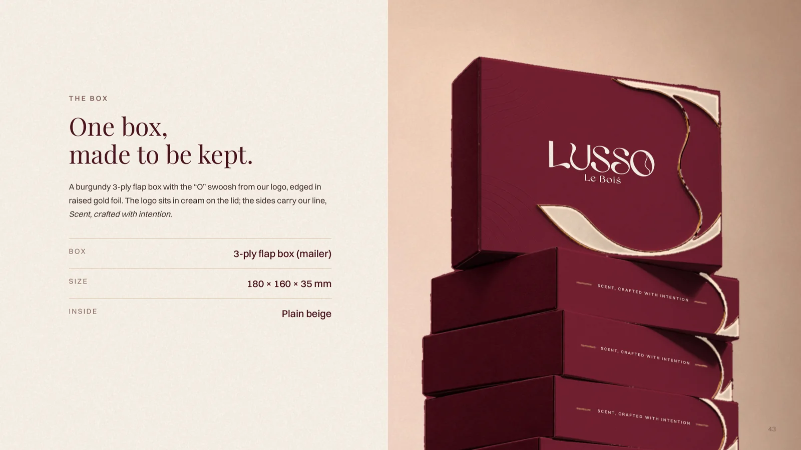
A burgundy 3-ply flap box with the O swoosh from the logo, edged in raised gold foil. The logo sits in cream on the lid, and the sides carry the line Scent, crafted with intention.
The details page gives the printer everything: the flat layout with cut and fold lines, the finishes, and the rules. Use the master logo file only, keep text 4 mm inside every fold and cut, match the burgundy to the printer's physical sample, and never print the gold as yellow ink: it is foil.
The system is shown across a website and social direction, A6 scent cards in each scent colour, thank-you and how-to cards, stationery, swing tags and signage.
Trishir, Creative Designer, India. Portfolio website: Trish Designs (trishdesigns.xyz). Email: trishir821@gmail.com